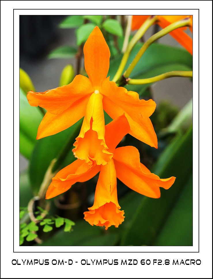
This is another one of these images where you would have to conclude that the saturation slier has been increased to the max. It wasn't touched at all. This is the colour of this orchid as I saw it and how it was processed in LR 4.4.
It actually makes a difference if I look at this image on my calibrated monitor or on my notebook. On the calibrated monitor the orange is looks saturated but the channels have not blown. On my notebook however, the orange looks really saturated and I would have to conclude that the person processing this should back the saturation slider down somewhat.
So my recommendation to all out there, calibrate your monitor. Only then will you see the difference.
I wish I had an Apple iMac to compare the colours. Maybe that will be something for future thought.


